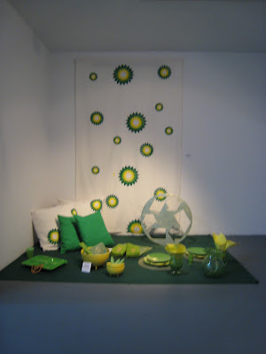
Part 2 of "Just Kick It Till It Breaks, currently on view at The Kitchen, 512 West 19th Street in New York.
A kinder, gentler conglomerate has been emerging ever so slightly in the past decade.
Fortune 500 companies are rapidly implementing policies of "social and ecological" sensitivity.
One in particular to note, BP, (formerly known as British Petroleum.)
See this caption below taken from the BP website.
(try not to sue me, I'm giving you guys credit here....)
Helios Power-- Our renewed commitment to make things ‘a little better’ for customers at our gas stations, through a new look, feel and fresh appeal
Find how we're doing things 'a little better'
Yes, even big oil is coming around to the new society of the 21st Century.
Or are they?
Taking the sunburst BP logo and uniting it with imagery commonly found in the currently treasured house and garden heart of America-- Ikeas, Crate & Barrels, and Pottery Barns of the world should take note.
After all, for all the plastics that they sell-- furniture, dishes, shower curtains-- what component is a main ingredient?
OIL.
And make no qualms about it, these colors have been selected by the designers for a reason.
Green:
From
http://www.princetonol.com/groups/iad/lessons/middle/color2.htm
"Green has taken on a very strong connotation as the color representing ecology and concern for the environment, however, it also conveys meanings associated with money and the suggestion "to go ahead" which is obviously derived from traffic lights."
From Wikipedia:
Yellow:
Sunlight, joy, happiness, earth, optimism, idealism, wealth (gold), summer, hope, air, liberalism, cowardice, illness (quarantine), hazards, dishonesty, avarice, weakness, greed, femininity, gladness, sociability, summer, friendship, Taurus, Leo (golden yellow, star signs), April, September, deceit, hazard signs, death (Middle Ages), mourning (Egypt), courage (Japan).
What better way to sell (and perhaps deceive) a naive public than to use "pretty colors."
I took this photo below the other day in Brooklyn to help illustrate the point.
BP is makings its stations more user-friendly; more home-like-feeling, "a little better."
I had to almost break into a guffaw here, for how much does pumping gas remind you of homemade pumpkin pie-- it truly is All American.
I personally would suggest a decomposing cartoon dinosaur melting into a pool of black ooze to illustrate a more "at one with nature" marketing ploy-- Little boys would love it!
But it is a sign of the times when corporations are finally using the billions in their marketing budgets to promote something a bit different than mere consumption; in this case, they're also selling "an experience."
Backstrom and Walker are also showing something to the viewer that's not easily recognizable-- the constant barrage of images of daily seduction-- "buy this, wear this, eat on these, sleep on these, cuddle up in this.”
And all of the above companies certainly do justice to deception at its finest.
Brilliant work by Backstrom and Walker.
I just hope they don't get sued for copywright infringement by the suits, but you never can tell when someone is making a point-- and a very strong one at that.
More reviews to come this week.
In the meantime, enjoy the below websites.
Walker is represented by Paula Cooper Gallery.
http://www.fiabackstrom.com/
http://www.thekitchen.org/


No comments:
Post a Comment