Wednesday, June 27, 2007

Just two days left-- hurry for Tobias Putrih exhibit

Been a hugely busy past couple of weeks.

The six-day, dual career work week has been lulling me into complacency as of late for reviewing time, but soon I will be having some nice new imagery/reviews up in the next coming weeks.

Summer always gives us a nice opportunity to check out that field known as "emerging" artists, or the new guard, or youth troops; group shows; tributes; and the dreaded "group show," a.k.a., "Filler."
But before we delve into the depths of summer, summer, summertime... let's reflect on master wood draftsman Tobias Putrih.

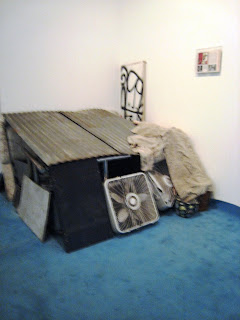
Much in the way of an Ikea do-it-yourself project gone horribly awry, or the classic link-in-log sets you used to play with as a child, Putrih has taken over the window of Max Protetch Gallery.


Even though previously I discussed the Yue Minjun exhibit, the Putrih piece is NOT to be overlooked in the Project Space.

I love how the formation takes on a life of its own-- kind of a living being, a Burning Man for indoors, a plywood behemoth brought to life.

Minimalism at a crossroads with the power of mathematical combinations.


Which shapes or forms can you construct?

Too inumerable to count!

I also find that it's also a nice take on consumerism-- because once you buy one piece, you'll need more to complete the project, the quote/unquote "vision."

Just be careful-- you know how cheaply made those prefab furniture sets are.

This is only up until Friday the 29th-- HURRY!

Friday, June 15, 2007

Janaina Tschape at Sikkema Jenkins & Co.

One of my current favorite shows right now is Janaina Tschape at Sikkema Jenkins & Co.


Her work brings to mind sea-like organisms tossed amidst luxurious fabrics and organic formations, such as a jungle in a strange land inaccessible to the human touch except through the subconscious realm.

Each of Ms. Tschape's abstracted works tend to be nature-focused in their makeup.

Take for instance, the honeycombing effect so prevalent in her backgrounds.

With "Cosmicomics," the work at right--I cannot help but be reminded of hollow seed shells left tumbling by the roadside in the backwoods of Vermont.


Compare the intricacies here to a natural rock erosion formation in New Zealand at left.


(Picture courtesy of motheater2 on Flickr.)


The strong color saturations bring to mind the earlier works of Inka Essenhigh-- 2001's in particular, with its Walt Disney-fied blue hues.

I also cannot help but look at this work at right and see an instantaneous recognition of the tentacles of jellyfish or sea anemonies reaching out through the kelp gardens.

Sometimes nature can be found in the most surprising of places-- even in a show that states "accidents, blots or splashes are problems to be fixed, made coherent by instinctive aesthetic judgment."
(at least according to the press release)

Yet looking at the work at right, "Early Afternoon," compared with the image below, I cannot help but see many similarities.

There is a beautiful motion to her work-- soft, flowing out from center, much in the way the group of delicate sea creatures untangle themselves from their underwater gardens.


My favorite work is below, "Thicket."

I wouldn't find Bambi here... more likely an anaconda-- Tarzan lost amidst so much modern complexity.


The show will be up through June 23rd at Sikkema Jenkins & Co., 530 West 22nd Street.


(Tschape's Images courtesy of Sikkema Jenkins & Co.)

Thursday, June 14, 2007

Andreas Gursky at Matthew Marks

German ingenuity.
Scale + focus outside the body + mass + frigid cold =
Andreas Gursky

I'm less inclined to talk about the work at right than to highlight the person in front of it.


Let's just say with my camera I can prove to be a dangerous reviewer.

If not for my Canon Powershot's songbird chirping introduction, I'd most likely never be discovered by galleries with my stealth habit of snapping away.

Perhaps this is unethical of me-- especially since I'm posting the image of this person at right without his knowledge-- but what the hell, I'm going for it anyway.

Even though the current Gursky exhibit seems to not be causing much of a stir in the art review world (tepid, at best)-- again, as I always say, the measure of success for an artist is not always necessarily in a thumbs-up or thumbs-down from Holland Cotter, but more along the lines of, "How long does the viewer linger?"

In this case, the man at right (in perfect "David" pose here, might I add) lingered a good three minutes-plus in front of the work.

To me, that's a success.

Here's some more imagery-- I know for many it is a "been there, done that" issue being the biggest connection problem for Gursky and his audience.

Seriously-- he's done so much-- what else is left?

I have purposely left out the Formula One racing photo that's been highlighted so much in the press with the blonde in the short-shorts, the brunette model at the back, and the press corps with bulbs-a-popping crowding above pit row.

I felt it added absolutely nothing to this show whatsoever, and was more or less a Gursky-by-the-way-of-LaChapelle image-conscious piece of B.S. (wait... soooo how do I really feel about that piece?)


Marks' back room housed Gursky's aerial photos of the South Pacific.

They are quite nice, giving an immediacy with the viewer-- convincing me to believe I was in a hospital setting--perhaps a "Footprints in the Sand" poster was lurking nearby.

Gursky's German ingenuity is once again at hand here--- cold, ice cold, even with Tropicalia in close grasp.


Now I know that I denegrate art descriptions to many base terms quite often here at Lamgelina.


Perhaps it's my lack of a propert art educational background, or my not giving a shit when it comes to big words a la "The Brooklyn Rail"-- seriously, you guys put me to sleep with the academia talk-- but the work at left looks exactly like the chocolate marble cake my grandma used to make.

And if art can make me hungry for cake and let me eat it, too, well, then-- I ain't complaining.

(big word alert here for some "big" art)

"Schadenfreude" be damned.

Exhibit is up through June 30th.

Tuesday, June 5, 2007

The "Happy Buddha" himself, Yue Minjun

There's something to be said for an embrace of humor.


A smile can say many things.

Artist Yue Minjun (at left) has been doing his sort of self-portrait/tongue-in-cheek portrayal of modern day China through his Post-Tiananmen Square filter for over a decade now.

You will see advertisements for his work continuously in ArtNews, Artforum, FlashArt International, etc..

In fact, I cannot think of an issue I've purchased in the past 12 months that has not featured a gallery or international fair highlighting his works.

Since the early 1990s, Minjun has had this smiling figure at the center of his work-- whether in his paintings or installation work.

Looking at the makeup of this particular group of multiples-- hands clasped tightly together with outstretched arms--I cannot help but think of the solitary figure standing up to the tank in the legendary photo from the student uprising.


Perhaps Minjun's commentary here is that there truly is "strength in numbers."
But upon closer look at his version of the Terra-Cotta Army, you can see subtle differences at play.

Are those hands clasped together in defiance, or celebration??

Perhaps they really are showcasing a newfound freedom in the undercurrents of the invasion of capitalism-- look closely at the denim jeans each "soldier" here is wearing.

After all, in a good stretch, "taking a breather," you can visualize yourself leaning back, arms outstretched, palms expanding and feeling a true sense of peace.

Of course, laughter can bely other elements beneath the surface-- the phrase, "Laughing all the way to the cleaners" comes to mind.

Minjun's work does not sell for peanuts, after all.
The societal implications of "cultural revolution" in 2007 are quite different for modern-day China and its contemporary artists, especially with the out-of-control market at hand.

These terra-cotta warriors will not be buried in hiding for a millenia with an emperor, but most likely held in vast art storage facilities as the $ value continues to expand.

Interesting take on history in the making.

The Minjun show is up through June 23rd at Max Protetch on 22nd Street.


All images courtesy of Max Protetch Gallery, Chelsea

Friday, June 1, 2007

Mayhem... Someone Trashed Barbara Gladstone Gallery... and she's fine with it!!

"Arte-junk-era"... my new terminology of cutting-edge trust fund "artists" who specialize in the 'junking of gallery space'.


Where do I begin?

Okay, so I remember last year my first education in the new "gang of cool"-- Banks Violette's opening night at Bortolami Dayan Gallery.

I waded through the sea of Karen O. look-a-likes desperately searching for some air.

No, seriously-- Not only did this humid July night gallery opening reek of body odor, but also the smell of poseur-- As Dolores O'Riordan said so succinctly back in the early '90s... it "lingers," truthfully.

Today, amidst the ranks of the Violettes, Kohs, McGinleys, Snows, et. al, you can really get lost in the glory and glamour of it all.

Youth run amock, making a statement... but just what IS the statement other than pure eye candy?

I have many of the non-art "regular folk" I interact with on a regular basis question my taste in contemporary art.

(for instance, why do I find the "Ellie Fart" image at right to be worthy of posting?)

In fact, just the other day, my darling 19-year-old intern came up to me and said, "I love art. I'm going to own a gallery someday. But I can't stand this whole... 'Let me wipe my ass in some white paint, shit on a canvas, smear it in by rubbing real hard and calling it art.'"

Chick's got quite a point there-- and I don't even think she's seen the Koh exhibit at MoMa.

I also find the whole "collaborative" effort thing to be a bit tired as well as of late.

Something about today's profit-geared system makes partnering with your competition feel forced, as if it's "expected," but something the participants are certainly not enjoying.

And so we come to Kai Althoff and Nick Z.'s takeover of Barbara Gladstone's 24th Street headquarters.

Mind you, Barbara is probably used to it by now, given her regular roster of the cutting-edge.

But this exhibit truly IS all over the place-- literally, and figuratively.

There can be such a thing as "too much."


First, let's start with the floor-- a tacky teal insulation rubber foam that's been brought in and topped at some points with junk throw rugs (yes, the kind you'll find in East New York for sale in exchange for crack money).

Interesting juxtaposition-- sealing the exquisite shiny concrete polished floors with things that are not pretty-- I get it. "Bring in the ugly."

Then, the overly tired references to childhood.

Scattered throughout the gallery are memories of our kid years-- certainly the plasticeen 1980s come to mind-- mini-shopping carts with trikes for the tykes.


Video projects on the walls-- small paintings-- small thoughts-- cartoon objects-- then, at the entrance, the well-made graffiti standard of Nick Z.-- a tag that I'll need for my friend Kezam to decipher.

Well-painted, as a three-dimensional standard tag with the usual blues, greens and purples of eye-catching local art, but having seemingly nothing to do with each other.


If I wanted this, I'd go to 5Pointz in Long Island City any day to see this type of art.

Moving on-- we have our sturdy "fort" built with rubber throway panels, a few broken fans, a tarp of unknown filthy dirty fabric.


Does this illustrate the nature of parental protection-- or is our place to hide from reality of the grown-up world?

Unsure.

Certainly the most striking of all the assembled objects of this show is the broken wall hanging in limbo imagery.

Looking as if Optimus Prime himself came barrelling in unobstructed, this is by far the biggest strength of the exhibit.

It certainly could also reference "Enter Sandman" at any point as well.

All the cutesy "Elliefart" Post-Its in the world can't add up to the power of this single work.

I look at this and I think of the wall as the "establishment", and the artists' breaking down of barriers (what little there are left).

Breathtaking, if you ask me.

Truly, if the pieces in the show would have more storylines connecting them to each other, the exhibit would have been far more powerful.

Unfortunately, this is a Ritalin nightmare waiting to happen.

Just like a play-date that's been extended too long, Ms. Gladstone should have put her foot down at the 25-cent cigarette jar at the assistants' counter and offered Dum-Dums instead.
I also have to say that this exhibit is kind of risk-based, especially if you are one of a clumsy nature.
The lighting is very dark in places, so be careful where you step-- seriously, there's stuff everywhere in parts of the gallery that you least expect to jump over!


Althoff and Z might be "better friends for it," but I don't know how much the gallery workers will be happy with the clean-up of this nightmare.

Gotta love artists.

I'd give you a link, but there aren't any images up on the site right now.

So sue me for using mine.

Enjoy!

All images courtesy of Barbara Gladstone Gallery, Chelsea, New York, NY--
Kai Althoff and Nick Z "We are better friends for it."