For those still frequenting this old URL, click below for my Matthew Barney spotlight.
http://olysmusings.blogspot.com/2008/04/no-shirt-no-service-vaseline-required.html
Sunday, April 13, 2008
Matthew Barney post up
Saturday, March 22, 2008
The beginning of the end of Oly's Musings Part 1
 Hi, everyone.
Over the next week or so I'll be making some big changes. First of all, I'm going to now be posting directly to http://olysmusings.blogspot.com
The address of http://lamgelinaoly.blogspot.com will become an archive, but all posts will still be accessible. I feel that it's time I need to take my writing a bit more seriously, and though Perez Hilton might have found fame with a goofy blogger name, I most certainly will not.
My blog's title will remain the same, because it's my nickname, and that's what I do-- "muse" on things-- But you should know that my real name is Olympia Lambert. I am an independent art reviewer in living in Brooklyn, and working in Chelsea in the art world. I'm very proud of the reviews I've written-- all while hopefully maintaining a sense of humor and directness not in the usual realm of things. It probably will be a long time before I take Jerry Saltz's job away, but I'm working on it.
In the meantime, I thank you for your continued readership.
Next week marks the return of the biggest week in the NY art scene. I will be covering as many fairs as possible, just as last year. In the meantime, feel free to check out my latest review at ArtCal's Zine of Amy Vogel at Larissa Goldston. I found it to be one of the more interesting shows to see right now. http://zine.artcal.net/2008/03/amy-vogel-at-larissa-goldston.php
Be well!
Thursday, March 13, 2008
Whitney Biennial Part I -- Forget the art, what were they wearing?
Truth be told, everyone's already done a blog of some sort on the Whitney Biennial, and most of them focus on the art, as rightly should. Some liked it, some didn't-- such is life. I, as well, liked some of it; some not so much-- such is life. Anyway, lately I'm finding it more and more difficult to get in my writing time. Getting those precious hours to see exhibits is difficult when you work in a gallery, but there is an added benefit-- being able to go to "opening nights" and the occasional "museum function." So instead of focusing as much on the art of the Whitney in my first post-- which was generally unanimously agreed as being totally bereft of all color other than beige and grey-- let's talk about what the people were wearing, because we all know that's what really matters in the world of art biennials!! Of course first up there was A.A. Bronson riding in the elevator directly next to me. Little did he know that directly next to him was the girl who had given his recent John Connelly show a negative review. I hunkered down, slouching my shoulders, hiding behind my program. Either way, Bronson's beautiful purple kurta struck me quite dramatically in the sea of non-color. To say nothing of those glasses of his. Quite funky. And sure enough, down the stairwell was dealer Tony Shafrazi adorned in a dramatic purple tie with that shocking piece of white hair of his. I found it funny that I go to the ArtForum Diary, and sure enough, there he was right next to Bronson. Literally in the order I encountered him.
 (Jeffrey "I'm pretty darn adorably cute and not really an ice cream cone" Deitch
care of New York Magazine, photo by Patrick McMullan)
In fact, purple was the color of the evening. Lots of dresses and boots, and platform stillettos in the hue. But leave it to Jeffrey Deitch as always to have the best suit and tie combo. Purple and white stripes. Glasses as always impeccable. True, he is NOT shaped like an ice cream cone, as Deitch's website so deceptively portrays. Could it be that they have taken artistic license with his persona? Perhaps. I did not ask him what his favorite flavor was, and instead, smiled at my slight pace behind the legend himself. There's something about Deitch that makes me want to hug him. Yes, I find his lil' mug cute, even though I can occassionally art the "trash" he shows. Ahem... cough.. Nestnnnest...nest...dsshhh...snowcone... colon cancer... Cough. Sorry, frog in my throat. Go to http://www.deitchprojects.com/ for the to-die-for ice cream cone man with music to boot.
 Anyway, it was a lot of fun people watching. I enjoyed the scene as photogs blasted away taking pics of Doreen Remen (a member of the Art Production Fund trio of power grrrls) in her "message art" dress, off the shoulders, D.I.Y., very punk, very Vivienne Westwood, very WHAM! "Make it Big!". No, seriously. Where was the "Choose Life" shirts and Andrew Ridgeley? Not sure of the designer it was, but it rocked, as did the general feel of fashion taking over the art. Oh, wait. Did I say that? Oh, that's right. The two are one. Fashion is art. Art is fashion. We have osmosis. Yeah.
Certainly I don't expect these functions to communicate to the masses, because part of the biggest problem with contemporary art today is the fact it speaks only to those within its community. The "man on the street" quotient is completely obliterated. Then the gliterrati sits back and says, "Why don't people support the arts?" Well, maybe because we're putting in sculptures based on the shapes of bird shit, for one, and then calling it Giacometti. Uh... no. But alas, that's another post. Enjoy.
(DISCLAIMER. PICTURES USED HERE ARE THE EXCLUSIVE PROPERTY OF ARTFORUM INTERNATIONAL, AND THE WORK OF PHOTOGRAPHER DAVID VELASCO. THIS DOES NOT EXCUSE ME FROM POSSIBILITY OF LAWSUIT. I'M JUST GIVING PROPS WHERE PROPS ARE DUE.)
Tuesday, February 26, 2008
Cai Guo-Qiang-- I want to believe these cars won't fall on my head
 In short summation-- a show totally worth seeing, if only for the herd of Geo Metros being "bombed" up and over utilizing the Gug's atrium. It's a pretty stunning piece, especially from beneath. When you really look at how a vehicle explodes, the centrifugal forces always start with the motion of the trunk popping up vertically, then doing a somersault in mid-air. Cai Guo-Qiang uses the laws of physics and the structural weight-baring capacity of Frank Lloyd Wright's architecture to his own benefit with this brilliant take on the initial impact of a suicide car bombing.
Of course there's commentary here on the "war on terror," but you realize that with the cheaply mass produced "Metro" in use, that this is more than just a war being waged on Islamic fundamentalism, but also a shot to the heart of capitalist worshippers everywhere. We're losing the economic war to the behemoth powerhouse that the People's Republic of China has become. Whether telling of emerging artists, or emerging markets, Qiang's wildly successful when he's working with the sublime.
Truth be told, I found this much more Studio 54 meets Macy's 4th of July, but hey, what do I know.
"Head On," (aka the "piece with 99 lifelike wolves running and leaping in formation up the ramps of the museum, eventually crashing head-first into a plexiglass wall)-- is a tour de force, but I was pretty darn disappointed by the guys up close. I had expected these fierce creatures who'd rip me apart shred by shred; instead, what I got was a bunch of natty-looking stuffed animals that you'd see some kid throwing a fit over inside F.A.O. Schwartz. Their faces looked almost lovable at some points, and their eyes reminded me of a teddy bear's. Except for the gummy mouths gaped open in mid howl/growl there wasn't much ferocity behind them. After all, the piece isn't necessarily about nature and man, but more on man's #1 quality of being more lemming than lemmings. "Learn from your ancestors," Qiang seems to cry. Unfortunately, no one listens. Oly herself randomly smiled and walked under the wolves admiring their anatomically correct parts.
 Now I must say that I'm digging that the Guggenheim is making great strides in showing the contemporary artists of today, but honestly, I felt that the show drags a bit-- especially towards the top levels.
 The gunpowder "drawings" are beautiful creations, but they don't seem to work in the very architecture of the Guggenheim itself. The ceilings seem to cramp their style. I felt that they need a much more monumental wall to hang from-- here, they felt almost secondary to the randomly placed video screenings throughout the show. Either way, you've got to enjoy the sheer pyrotechnic power of Qiang's work. But honestly, I'm more into the work of another artist who specializes in explosions-- Ms. Rosemarie Fiore.
http://www.rosemariefiore.com/ Maybe it's that side of me that craves "color" and all that jazzmatazz, but the sepia tonalities made me sink into a deep visual depression. It seemed as if I was trapped in a Buddhist temple with no way out.
Also of note besides the exhibit itself was the relaunching of the newly refurbished exterior of the Guggenheim. They really did right to do the much-needed repairs, and the facade is just immaculate right now. It felt almost like going back in time to its heyday.
http://www.guggenheim.org/

Saturday, February 23, 2008
PINK EYE
 (cool image of pinkeye fishes by lightsight on Flickr)
Maybe it's from hanging out with too many donkeys in Vermont, but I have pink eye.
How on earth does one GET pink eye, anyway?
On "South Park" it turned people into flesh-eating zombies.
I also have adenovirus.
It's amazing, but I also have laryngitis right now as well!!
By all accounts, this art blogger should be dead.
I also have adenovirus.
It's amazing, but I also have laryngitis right now as well!!
By all accounts, this art blogger should be dead.
But I still live... unlike poor Kenny.
But I shall return... hopefully, seriously, next week, when the pink eye goes away and I feel good enough to actually write again.
 In the meantime, keep reaching for the stars, and Elmore and Garfield say a big hello from their barnyard.
Thursday, February 7, 2008
Dust you are and unto dust you shall return...
 "As he was leaving the temple, one of his disciples said to him, "Look, Teacher! What massive stones! What magnificent buildings!"
"Do you see all these great buildings," replied Jesus. "Not one stone here will be left on another; every one will be thrown down."
From Mark 13:5
Just as Jesus predicted, "All things must pass."
(*Or was that George Harrison?)
And so, too, have the Gothic churches of Poland, as exquisitely showcased in the creations of artist Joanna M. Wezyk, opening this Friday at Tina Kim Gallery. Wezyk's work takes a heart-wrenching look into these monolithic structures and the system they once supported that seemed forever ingrained in a culture so steeped in faith. But before I get into the inner frameworks of Wezyk's works and the structures themselves, let's take a look at the stage they are set on.
In January of 2007, the Archbishop of Warsaw, Stanislaw W. Wielgus, admitted to previous collaborations with the Polish Sluzba Bezpieczenstwa (s.b., or "secret police"). "Collaborations" is a multi-layered word here in this instance. For in the days of the "s.b.," this could mean anything from a briefing on what the Sunday collection was, to who might have been a supporter of the Solidarity movement. In the case of one outspoken priest's support of Solidarnosc, Jerzy Popieluszko, he was murdered in 1984. One can only imagine the level of influence to which clandestine informants helped in his demise. It's been estimated that nearly 15% of all Catholic priests in Poland during this period had some dealings with the s.b. Shortly after this revelation, Wielgus resigned in a flurry of controversy, shaking parishioners to their core. Here was a man elevated to a prodigious position of power in the nation's most populous city, and now, with the end of the John Paul II era, the church must reevaluate its own leadership and the roles they've played in the former Eastern Bloc.
Along with the ever present role that scandals have played in the breakdown of the Roman Catholic Church-- in the U.S. as well as abroad-- there are certainly other factors at work here, and first and foremost is the European Union's rapid escalation as a dominant economic powerhouse, and the secular overhaul of society at large. The church's influence on society has seen a rapid decline across Europe. Mass attendance is lower than 30% in many formerly predominant Catholic nations. Poland in particular, the very homeland of Karol Jozef Wojtyla himself, has yet to see the level of empty pews that have vanquished parishes with a rapidity not unlike the plague in the rest of Europe, but this is changing. A crisis of faith, lack of funds, and erosion of confidence is at play here as the once magnificent cathedrals sit in disrepair, awaiting a preservation that is more patchwork that total overhaul. In the case of Wielgus, here was an instance-- though long suspected-- that the very institution that helped to foster and form the gel of the Solidarity movement had in its own ranks those who assisted (though possibly inadevertantly) in the crackdown of pro-Democracy forces. And when the leadership which has long been held dear in the hearts of many Poles starts to crack, so too, do the walls of the institutions that house them.

("Earthquake in Assisi," above)
Today is Thursday, February 7th. The ranks of the faithful in Poland are awakening to the morning after their most attended holy day, Ash Wednesday. I almost have to wonder how the halls of these churches must sound with the faithful singing en masse. So many centuries of turmoil, of death, of pain; a culture torn assunder by war, genocide and political upheaval. Each of the above plays an important role in the works on display.
And so, now, the stage is set. Hopefully, readers, you're still with me. On Friday, one of the most beautifully and emotionally painted exhibits to hit the New York art world will open in Chelsea. Joanna Wezyk, a native of Krakow, absorbs all of the above mentioned elements into her paintings and more.
I recently met her at SVA's MFA open studios. But since I had already spotlighted two of her fellow classmates (Nicholas Fraser and Sarah Ferguson), I didn't want to necessarily rush into another review too soon. There's something about becoming the "go-to" blogger that can be a little risky, but I've decided that I love her work and I'd like to tell you so. And when have I ever not taken risks?
There's so much history evoked in each of her pieces. During Poland's darkest days-- and yes, where do we even begin-- the church served as a place of refuge, of safety and of neutrality. But as time goes by, as was the case of the previously mentioned Archbishop, we see not only a move towards the secular, but also a different value system taking hold-- that of the Western World and the new "almighty," currency. Given its chokehold on worshippers across the planet, suddenly these Gothic Cathedrals-- architectural marvels, hallowed halls filled with the spirits of millions of worshippers whose stories in many cases will forever be untold-- have begun their descent into disrepair, disuse, and ultimately demise.
(Detail of "Red Cherry Picker" below) The stories to tell are numerous-- a caved-in ceiling; peeling plaster; the juxtaposition of an altarpiece next to yellow construction tape; a boom lift sitting prostrate in front of the crucifix. There's so much sadness in each of these works. The high gloss of the oil paint itself gives rise to a feeling of blurred reality. The house of the one without original sin is now being sinned against. I think back to my own feelings of sadness at encountering the wreckage of the First Roumanian-American Synogogue on Rivington Street a few years ago. My eyes immediately focused on the carnage that lay before me-- two shattered stained glass Stars of David lie next to a bulldozer, bricks lay all around-- awaiting their final resting place. Wezyk's role as artist here is so important, because not only is she making a huge contribution to the art world at large, but also serving as a documentarian of history. Because of her own experiences as a Pole, she's bringing herself and her own experiences into the work-- not an easy task in today's shock value laden world of art stars. This takes great courage and great thought.
Seriously, check out her show.
You'll be saddened, amazed, sentimental, and hopeful all at the same time.
Beautiful work from a multi-talented artist.
For more information, please go to:
http://www.tinakimgallery.com/
or check out Wezyk's website at:
http://www.joannawezykart.com/
http://www.artcal.net/event/view/1/6389
artcal-6389
Wednesday, January 30, 2008
Great deal on some PRIME real estate
 Dia Chelsea, anyone?
Jorge Pardo deinstallation fees not included.
Mega broker Brown Harris Stevens gets the goods.
Any guesses on the price range?
Yeah, I know I write an art, not food review, blog, but...
 ...I can't help it.
Art needs a break every once in a while for that other pasttime of mine-- EATING!
So I'm giving my readers two restaurant recommendations.
1. X.O. Cafe & Grill, long a favorite of mine in Chinatown on Walker Street.
This evening I probably had the most outstanding dumplings yet from their fantastic menu.
There's nothing... I repeat, nothing fresher, more crunchy, more succulent, and scrumptious than the snow pea leaf dumpling on their Dim Sum list.
(pic of actual X.O. dumpling by Roboppy on Flickr)
I mean, look at that thing!
It has (at least I think it has) snow pea leaves, water chestnuts, black mushrooms?? and possibly garlic) stuffed so neatly inside.
It comes with this excellent, thick and sweet dipping soy sauce.
I add the hot chili oil to it, and it just brings me to tears.
So good it melts in your mouth.
Besides their dim sum, they're quite known for their hot pots (sizzling beef and veggies on your table) as well as the pretty ridonkulous fake tree in the middle of the joint.
(http://www.yelp.com/biz_photos/NoSvSAhVwUFLeqRG-gBtQg?select=GNMsc5VlPklBODfdhUwIWw) And... and... if that's not enough, take a look at my other favorite dum'lin'... the crystal shrimp dumpling.
The shrimps are meaty, sweet, pink, and so delicious.
I love the litle orange roe on top, not unlike Christo and Jean Claude's perfect shade of orange.
The Gates, anyone?
In fact, I believe these are works of art.
Indeed.
(photo again credited to Roboppy on Flickr)
And I finished it off with my usual Taro Root bubble tea.
X.O. is located on 96 Walker Street by Lafayette Street.
It's right around the corner from the Canal Street subway station.
And second, I had my first ever Sri Lankan food the other day.
The Nirvana Cafe in Gramercy exceeded my expectations.
(a look into the spice influences of Sri Lanka-- image from Byflickr on Flickr)
I thought Sri food would be very similar to Indian.
Yeah, sorta, except imagine your spicy quotient upped to heights never before seen, and sauces that are never liquidy, but thick and rich.
I had a quite chunky mint chutney that was truly from the gods.
This sat atop my order of vadai, 4 crisp lentil patties fried to a crisp perfection.
So delicate, and yet so meaty.
There's much more influences in their food than I expected-- French certainly being one of them.
As for the spices, my mouth was on FIRE the entire night, and I just wanted more and more.
I was tempted to get the hoppers, (crispy, curved crepes, one with egg in center, served with a chili relish katta sambol and a curry*), but I knew if I ate more than the 5 pounds of food I had received so far, I might explode.
http://www.lankalibrary.com/Food/hoppers.htm
(check out this recipe for do-it-yourself hoppers-- Warning, bad joke alert, this is not to be confused with Edward Hopper)
Some interesting vegetable sides came with my order of chicken curry (Five Alarm hotness)-- softened green beans in a sweet, yet spicy chili paste; chilled collard greens with minced scallions, shallots and garlic,with shredded coconut; and piping hot sweet potatoes in a delicious peanut sauce.
Nirvana Cafe is located at 213 3rd Avenue at 19th Street near Gramercy Park.
Since most of us don't have keys to that silly park anyway, why not scarf down some good eatin's instead!
Check out their website.
http://www.nirvanacafenyc.com/
You can also use this nice menu from MenuPages as well.
http://www.menupages.com/screenmenu.asp?restaurantId=44149&htmllink=FAFB84DC211E58E91E64F7AF1F6BF7798B5F5D9FD3660349FEB02E4FF18C64EAA7F241465A0806B1&taglineid=0
Wednesday, January 23, 2008
Philly Road Trip!
 Several weeks ago, I had to get out of the city.
I felt I was chomping at the bit and just had to go somewhere... anywhere.
Stress was really getting to me, and sometimes the best thing one can do is go do something one loves, whether you have the budget for it or not, and that thing for me is travel.
My initial solution was "Go to Montreal," as I had done numerous times before, but that didn't work out the way I had planned-- an eight-hour bus drive and stomach ache from hell were huge factors.
And so I said, "Let's go to Philly instead. I love it there."
Having not set foot in the city of Brotherly Love since 1994, I figured I could use that extra dose of old brick buildings and cobblestone streets, so set apart by a successful historic preservation commission's hard work-- something New York City could use a good lesson in.
So off I went on December 30th and 31st, 2007 to close out my year-- a Sunday and Monday respectively, but not really the best time to go gallery hopping.
But it turned out I went there on just the right day.
My feet were aching terribly, having trekked all the way from the Italian Market and Bella Vista neighborhood all the way past Independence Hall, Franklin's Grave, to the Old City's amazingly transformed arts district.
Hungry, tired, and sick of seeing galleries with closed doors, there suddenly appeared a window of sheer color-saturated beauty I could not ignore.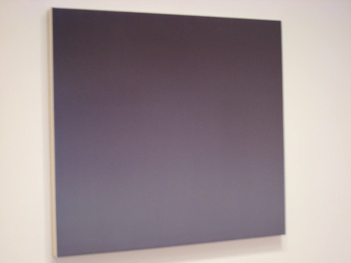
This piece by artist Mel Davis' sat there in the window of Larry Becker Contemporary Art like my own siren's song of pulsating color rhythms pulling me in.
My nose pressed against the glass, the lights were on.
A woman came to the door.
Heidi welcomed me, the weary traveler, with a smile, into the gallery.
They weren't open, but were getting things together for the group show's launch to the public.
The exhibition, "In Light" delves into the possibilities of the color pallette; how canvas preparation and care can directly effect the viewer, playing with reality and our sense of space and time.
Mel Davis, Andrew Graham, Tom Benson and Howard Smith are a minimalist's dream quartet.
In this exhibit, there are direct references to the monochromes of Kasimir Malevich, Ad Reinhardt, Robert Ryman, and Yves Klein.
But along with the usual suspects of minimalism, monochrome painting and suprematism, each of these artists is doing something new with their respective works.
In the case of Andrew Graham, he uses color theory as a science, and plays visual trickery on the human eye.
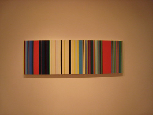
The work must be seen in person close up and for an extended period of time.
A recent graduate of UPenn, Graham's lines of sheer color stream as if the color bars on a television set.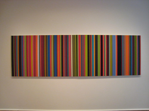
Utilizing artist's tape, each stripe almost blends perfectly into the other; its corresponding color at times completely unnoticeable, except upon second look.
Even when I took these pictures, I kept looking at my camera's image back to me.
Nothing was exact. The colors appear almost in motion, and no matter which setting I used, there continued to be at least a few colors that would transpose with another.
So not only do Graham's works play tricks with the human cornea, but also with digital 7.1 megapixel Canon shutters as well!
My favorite moment was suddenly noticing the tiniest band of lime green next to an earthy terra-cotta orange and pink.
It truly had escaped my eye, and I was so excited to be able to find it.
Here was my own Waldo, stripes and all, hidden in the crowded color field before me.
In Mel Davis' works, the canvas is prepared with such a gradual gradient hue, that it's again, almost unseen to the naked eye.
It is only upon deep introspection into the piece itself that the colors come out, and the different shades of blues take over.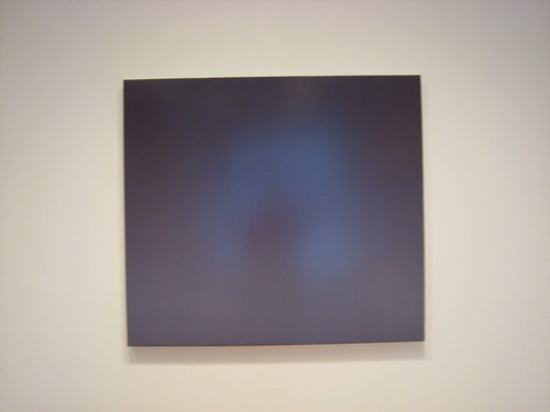 In fact, there's such a refractive quality to the light, that you can literally see yourself in the center of her images-- giving the works an almost mirror-like effect.
I was immediately reminded of the paint on vehicles from the 1950s-- the golden age of cars-- smooth paints, sparkling almost like the fins on a Ford Fairlane.
In the same way Davis' paint application has an almost retro feel.
There are certainly elements of the color-fieldists, but she is making the work her own.
In Tom Benson's work, the paint is the process.
At first I thought they must be poured directly onto the aluminum sheets beneath, their surfaces being as slick as an ice rink, but this is quite incorrect.
Benson's brushstrokes have a true craftsmanship quality with each subsequent motion of the hand. Only upon an extreme macro closeup photograph can you actually see the gradations from the individual brush hairs' grasping of the pigment.
Benson also develops his own paints.
On first look, this work appears to be a black rectangle-- nothing more, nothing less.
"A tribute, perhaps, to Malevich's black on black", I surmised.
But then I looked closer.
This wasn't black at all.
It is the deepest shade of green that there can be-- "Italian Green Earth" is what Benson calls this.
I imagined myself in the densest of dark forest-- old growth trees, sheltered from humanity, with no light from above, and only a soft mist caressing my cheek.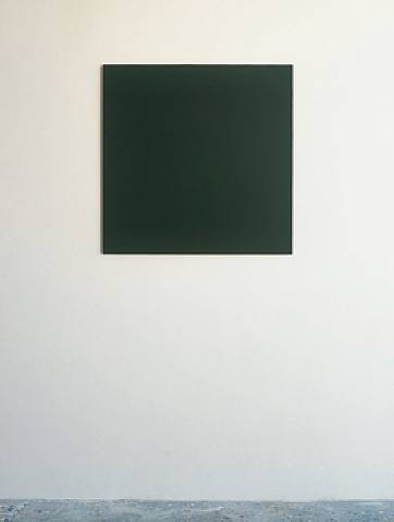 Perhaps a dark green moss lurks on the gallery floor; or overgrowing the rocks beneath.
Benson has set the mood in a way that really brought me into the works.
Mission accomplished.
This was more than just "color on a panel", but perfection in simplicity.
Here was a show tailor made for my weary, travel-logged soul, which almost accomplished a spiritual awakening.
Howard Smith has had numerous shows over the years and has an incredible knowledge of how to bring in the viewer into not only the image of the color-- each brushstroke at first glance appears to be an angry mark-making, but alas, it's not hastily made.
A long term explorer into paint as process, Smith's paint grabs each and every bead of cotton canvas, not unlike the skin of a freshly plucked chicken, seeing each bump appear where the feathers once called home.
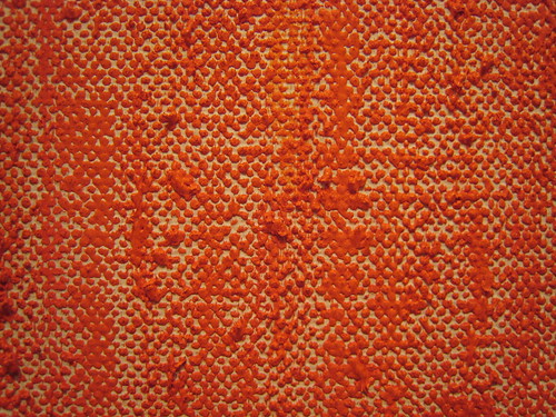
It is quite time-consuming, and he is careful of where each stroke chooses to lie.
Take a look at this closeup, and how the hyper-orange paint rests so perfectly upon each portion of the cotton duck.
It's pure beauty in saturation.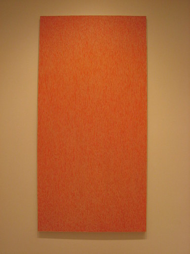 There is no need for gessoing or sanding with his works, because the canvas itself plays an essential role to each of his pieces.
There are similarities to Smith's painting style to that of Julian Lethbridge, who had a fantastic show last year at Paula Cooper Gallery.
But here, paint intersects with the blank sheet; like two lovers intertwined in embrace.
A beautiful thing.
The exhibit runs through Feburary 16th, so I highly recommend taking your own road trip down there, or if you're in the Philly area, it's a show not to be missed.
Oh, and if you have the chance, make sure to give a big hello not only to Larry and Heidi, but also gallery cat Pink, who is quite curious with art bloggers.
Apparently not only is she adorable, soft and furry and quite cuddly, but is a bit of an art world celebrity herself, having appeared in a photo spread in Art Forum, no less! Truly precious.
For more information, go to:
www.artnet.com/lbecker.html
Monday, January 21, 2008
Yes, Canadians can be sexy, too

Untitled (3 Satyrs/ 3 Nymphs) 2007, by Theresa Sapergia.
Part of the "Captive Visions: Contemporary Canadian Art" currently on display at Eli Klein Fine Art.
Gloriously sensuous and a quite naughty piece.
Love it.
Sunday, January 20, 2008
Two curatorial things of mine you can check out
 First off, I'm not one much to toot my own horn when it comes to my activities and private career outside of blogging (I feel it's a bit improper to give away too much) but in this case, I felt it's time to give my readers a link to something special I've taken part in.
I was one of three curators for the current Winter Salon showcase at Denise Bibro Fine Art here in Chelsea.
My invitational selections for the show of artists were works by Daniel Giese, Christopher Reiger, Martha Walker, Ric Dragon, Michael Paul Miller, and Sarah K. Bean (image on left)-- all of which I can say are truly stunningly fantastic works being done by these extremely talented artists.
I also got the opportunity to select the works of several of the gallery represented artists-- Lisa Dinhofer, Carol Jacobsen, and Charles Olson-- as well as assisted in the selection of the works of Josephine Haden and the ever fantastic Joyce Korotkin.
Originally the show didn't have a theme, but I found that with each of my choices that I was starting to tell a story with the works-- man's altering of nature; an apocalyptic armageddon on the horizon; sensual lines and loops; and mastery of color, line and form.
Everyone included in the show I'm so very proud of, so I would love it if my readers could check it out.
http://www.denisebibrofineart.com/exhibition/view/1153
My other recent project is not on the professional curator circuit, but on Flickr itself.
One of my favorite things about Flickr is the ability to have a "favorites" section.
One of my favorite things about Flickr is the ability to have a "favorites" section.

(mmmm.... I'll have a Super Roast Beef with Horsey sauce, please...)
In my case, what I've gone about doing is try to remember everything and everywhere I've ever been before-- tracking sites and places from my childhood all the way up through today-- then going and finding them by doing Flickr searches.
Sure, that's time-consuming, and could possibly take up another lifetime, but it's worth it.
 Included in my "selections" are searches for the Arby's Roast Beef sign in Tacoma, Washington; the Shell Factory sign in Ft. Meyers, Florida; Bok Tower and the Citrus Tower of Central Florida infamy; a pony in Wisconsin; Queechee Gorge, Vermont; Montreal; miniature daschunds, and places I want to see-- the Stave churches of Norway, for instance.
Image at right, "Norwegian Smile" by shoko!! on Flickr.
When I saw the Arby's sign still going strong, it brought a tear to my eye, as well as the tiny A&W Root Beer mug, which is exactly like the one I drank from when I was about three years old.
If you have 10-15 minutes out of your day, I highly encourage you to check out my slide show of these "curatorial selections."
They've just bowled me over in their quality and sentimental aspects.
As a question to everyone else-- if you have a Flickr account, please feel free to share them here.
I still think it's one of the best invention ever to view amateur and emerging photographers.
Enjoy.
http://www.flickr.com/photos/lamgelinaoly/favorites/show/
Monday, January 14, 2008
Mandatory art video site to check out
www.vbs.tv
Just some great interviews with artists there.
Check it out-- especially the Aurel Schmidt interview.
Friday, January 11, 2008
Gee, thanks, Bank of America and John Connelly
 The United States of America was thisclose to having an industry go under and be forced to take responsibility for their own greed and ethically abhorrent practices.
But noooooo... Bank of America (my bank, thank you very much) decided to save Countrywide's ass from total annihilation.
Way to go, BOA!
Nothing says "lesson learned" by letting the upper echelons get away scot-free, as per usual, and have millions more in profits come their way from the continued shady practices of their brokers.
FYI-- the new way for brokers to get around the approval process is to stick people into "FHA" programs who do not qualify, and are not meant for this government-sponsored program.
Be prepared for the fallout from that one in another three years' time.
In related news, last night's opening for the A.A. Bronson's Shamanism exhibition at John Connelly Presents was wall-to-wall immobile last night and stank like piss, sweat, barf, dead fish, beer and cum.
No lie.
I literally almost threw up in there, it stank so bad.
Just like Bank of America, let's compare Connelly.
(image at right from Hrag Vartanian www.hragvartanian.com) In one of the "pieces," performance artist Michael Dudeck sat there nude, covered in head-to-toe white body paint, cradling a dead fish, perhaps wearing a long black wig, looking about as intriguingly in depth and spiritually relevant as Keanu Reeves did in "Little Buddha."
Great show, you guys.
Much in the same way that Bank of America bails out a bankrupt system of corrupt businessmen, Connelly bankrolls artists that are continuously suited for theater and theatrics rather than work that is anything but hard-hitting.
And Terrence Koh's "glory hole" bathroom stall was about as brilliant an idea as any addict in the Port Authority john could come up with.
Great stuff.
Did they watch the news or something about Senator Larry Craig and his wide stance?
Because if so, the Brad Pitt and George Clooney video spoof was 500 times better.
First exhibit of the year I've panned.
Please excuse my hate-filled vitriol, but I just can't keep my opinionated self confined when I see this type of work exhibited when so much better stuff is available.
Perhaps this means I'll be blacklisted, and I'm violating the rules of "be nice and find the good things when you write reviews,"' but what can I say, I am what I am, just as they is what they is.
So to Mr. Connelly and corporate America, (you are one and the same, no matter what your flowery press release language is) keep on the keeping on by propping up complete and total junk.
Eventually you'll learn that the stench doesn't necessarily go away when the exhibit comes down.
It lingers.
Oly, over and out.
Sunday, January 6, 2008
Robert Appleton at Paul Sharpe Contemporary Art opening this Thursday
 'Howdy, sailors.
As I've stated numerous times, sometimes work that really gets to me the most is made by artists that are having fun with their talents and not taking themselves too seriously.
And there's few artists I enjoy more than New York-based visual and performance artist Robert Appleton.
His visual creations and theater sessions always gives me a good chuckle, whether he's performing in fishnets dancing a chorus line county fair talent show audition; portraying Jeffrey Dahmer devouring watermelon human flesh on stage; painting mustachioed sailors who'd make any Village People member proud; or simply creating whimsically deviant sailor puppets in multiples.
In the past decade, Appleton has well-honed himself as a storyteller-- highlighting characters who might have downed a little too much of the 90-proof, if you catch my drift.
These are well-lived souls, with plenty of battle scars to show for it.
Appleton always gives an interesting take on their plights-- soon to set sail, a battle ahead, a life quite likely soon to be taken and sunk to the bottom of the sea. Of course, many times his subjects have been society matrons, who truth be told can drink any sailor till he's weak in the knees, dropping them to the poop deck in crisp piles of Blue Jean Collars with bell-bottomed trousers.
You certainly do not need to be 'In the Navy' to knock 'em back.
If they give posthumous honors, Judy Garland could be a Navy Rear Admiral, for Christ's sakes.
It's a delight to see Appleton premiering his new sailor series at Paul Sharpe Contemporary Art in Chelsea based on portraits of actual sailors from 1750 to 1849.
Each one has lovingly been given his own personality.
In many cases, each subject seems to not necessarily look like he's very comfortable with his choice in careers.
Take a look at this poor fellow below.

After all, who would want to go to sea for months straight in those times?
You can literally read the dread on the sailor's faces.
Below is another fresh-faced foppish youngish chap.
His decorative hat is a nice embellishment-- but just what is that on his forehead, hmm? Perhaps an in-joke, or perhaps not.
I do have to say I love the slight-of-hand subtlety in Appleton's pieces.
His questioning of sexual identity (bottled-up searing young masculinity cooped up in tight quarters for extended lengths of time) is a hoot, and quite truthfully spot-on.
Whew, it's getting a bit hot in here, isn't it?
Appleton possesses an almost cartoonish-style in his brushstrokes, giving his subjects these huge eyes, smeared lipstick, with hauntingly lit backgrounds.
It's almost as if Karen Kilimnik has met Toulouse Lautrec and they're tossing a few back while at port with Carol Channing and Napoleon.
This is one opening I will not miss.
Too bad it's not also Fleet Week, because that would be the icing on the cake.
Paul Sharpe Contemporary is located at 547 West 27th street on the 5th floor.
The opening is this Thursday, January 10th, from 6-9pm.
For more information, go to:
http://www.paulsharpegallery.com/
Tuesday, January 1, 2008
Let's start the new year off with a bang
 Happy New Year, everybody!
Hope you all have sobered up and are ready for another year with The Musings.
Just got back from a fantastic, but quick, trip to Philadelphia.
More on that later-- I have a great exhibit coming up for your perusal from Larry Becker Contemporary Art.
But first, a quick spotlight on an artist I met at SVA's recent MFA Open Studios.
Her name is unforgettable-- Sarah Ferguson-- and her work as well.
Though she has immediate identification with British royalty, she instead spotlights our own royalty of American politics, the Queen herself, Hillary Clinton.
Imagining and juxtaposing herself into "photo-ops" with Hillary-- whether that of advisor, trusted confidante, or loyal friend-- Ferguson's work is not to be missed.
I love the humor in this-- the imaginative quality.
All of us at one time or another wishes we could have the ear of those in power, just to give them our own two cents' worth. What also strikes me about Ferguson's work is her great ability to document the humanity behind the public image.
In the case of Hillary, far too often what we see so often is a manufactured being; stripped of her own femininity, and pandering to the lowest common denominator-- the "American voter." But what Ferguson gets at is raw vulnerability through her paintings.
You can see the pain of a life lived-- and lived in its fullest, with emotional pain and baggage hidden and underscored by a brilliant mind, wrapped in powerhouse packaging.
In the nude at left, Ferguson imagined Hillary's makeup from pieces of different women's bodies.
After all, what Hillary represents at this time in history is is an amalgamation of the "American Woman."
Interestingly enough, if Hillary Clinton wasn't "Hillary Clinton," wouldn't the momentus occasion of a woman running for President be received quite differently?
Ferguson will soon have her Master's from one of our nation's top MFA programs.
I dare any gallery not to consider her work for its timeliness, its stunningly creative humor, and emotionally dark underpinnings.
Great one to watch in the year ahead.
Check out her blog at http://hillaryrealandimagined.blogspot.com/ and her Flickr page to see more great examples of her "photo ops" collection.
http://flickr.com/photos/shferguson/
Wishing all my readers the best in the coming year,
Oly
Subscribe to:
Posts (Atom)
