Oh, right... "The F Word" and its many meanings and interpretations.
At right you're looking at Susan Paul Firestone's "Daphnae" work.
This is a segment of her assemblage that really caught my eye.
Firestone has laid little trinkets in a plexiglass box, and swaddled them in a glorious red fabric.
It's always interesting when you see art in miniature.
In this case, she's putting elements from her childhood into a box.
There's something about how we collect things and then put them away for "safety's sake."
The porcelain make-up of this work seems quite fragile compared to its basis, Giambologna's legendary "Rape of the Sabine." (see below)
 Placing an image of such grandiosity into miniature once again removes the imposing threat.
I've commented before on how size influences interpretation, and this certainly does not lie.
The other beautiful thing about Firestone's placement is how the stark white and tiny shells brings to mind evolutionary elements-- from the sea we come-- the nakedness of the bodies forcing their way up and out, much like Venus from the seafoam.
A truly beautiful piece-- the sensual reds and whites in perfect unification.
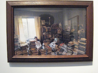
 Next up, work that really struck home, Gina Gibson.
I've done several conceptual exhibits myself before on Obsessive Compulsive Disorder-- specifically "Hoarders."
The minds, in these cases, cannot control a compulsion of "collecting"; always needing more, and not being able to separate what is needed from what is not.
These examples here are much more an accumulation of "Things" or "Stuff."
 The disorganization is heart-wrenching, as well as the artist's and her fiance's family members in the photos.
As opposed to Firestone's safely-encased and well-laid-out mementos, you feel so much might be damaged or lost here-- clothes and books left precariously out in the open-- soon to be beyond repair.
As a child of a hoarder, this hits home very hard, but I must say Gibson does a fantastic job at capturing the 1970's wood-panelled dark interior along with the light flooding from the windows.
Stunning work that captures familial pain and its elements of souls lost amidst endless clutter.
 Next up, my first photo posted from the other day, the video piece of Janet Biggs, "Amanda on Top, Twins Below 1996."
I couldn't help but be mesmerized by her undwater takes of the twins frolicking in the pool together-- inner tubes keeping them afloat; waists turning; legs kicking back and forth in fruition.
I was reminded of so many times as a child where the kids of the neighborhood would put on their swimsuits and do handstands at the bottom of the pool and compete to see who could do the best synchronized swimming, like little Ethel Mermans cavorting about.
I feel it is a beautiful and somewhat romantic vision of tiny ladies that cloaks the dangers of what may pass.
 Finally, I don't want to say that as a reviewer I bow to outside pressure, but since I got a wonderful comment from one of the many fine ladies in this show, I'd like to also include her work at right.
This is Brenda Oelbaum's "Osama's Bin Degraded," a 2004 photograph edition of 5.
I have to admit, at first glance I didn't think much of it given its political nature (I tend to roll my eyes at statement art) but upon closer look, I like it less as that and think of it much more as a homage to the tacky.
In this case, "tacky" is 9/11's 24/7 media coverage mixed with a cheap "throw" rug-- one that will be stepped upon, and the cheapening of the woman at right.
Freshly waxed legs, blood red polish-- (most likely Maybelline, judging by the bottle.)
It feeds into multiple female stereotypes and spits them back out at us in defiance.
The woman takes the place of the terrorist here-- assaulting Bin Laden's self-created God-like image.
She is a one-woman soldier bent on disobeying the Taliban's or Islamic fundamentalist view of what a woman should be.
Yet perhaps her independence is a fraud itself.
For how can a woman truly be independent when she plays into our own society's version of what a woman should be-- soft-legged, artificially enhanced or made-up?
I feel that it poses a lot more questions than answers, but this is what I like the most about this work.
Art that challenges is always the best.
For that, I give Barbara a two thumbs up and a "You Go, Girl."
Forgive me for my 1999 references, but alas, it's been a long week.
Enjoy the weekend, art lovers!
Lamgelina Over and Out

1 comment:
Pressure peeshaw!!!
You're a hoot, Keep up the great work...I look forward to reading more of you critics...Only wish I lived in New York so I could chase you around to all the galleries.
Brenda O.
Post a Comment