 Several weeks ago, I had to get out of the city.
I felt I was chomping at the bit and just had to go somewhere... anywhere.
Stress was really getting to me, and sometimes the best thing one can do is go do something one loves, whether you have the budget for it or not, and that thing for me is travel.
My initial solution was "Go to Montreal," as I had done numerous times before, but that didn't work out the way I had planned-- an eight-hour bus drive and stomach ache from hell were huge factors.
And so I said, "Let's go to Philly instead. I love it there."
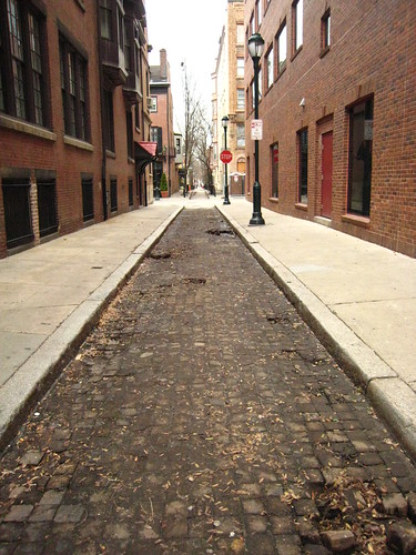
Having not set foot in the city of Brotherly Love since 1994, I figured I could use that extra dose of old brick buildings and cobblestone streets, so set apart by a successful historic preservation commission's hard work-- something New York City could use a good lesson in.
So off I went on December 30th and 31st, 2007 to close out my year-- a Sunday and Monday respectively, but not really the best time to go gallery hopping.
But it turned out I went there on just the right day.
My feet were aching terribly, having trekked all the way from the Italian Market and Bella Vista neighborhood all the way past Independence Hall, Franklin's Grave, to the Old City's amazingly transformed arts district.
Hungry, tired, and sick of seeing galleries with closed doors, there suddenly appeared a window of sheer color-saturated beauty I could not ignore.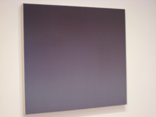
This piece by artist Mel Davis' sat there in the window of Larry Becker Contemporary Art like my own siren's song of pulsating color rhythms pulling me in.
My nose pressed against the glass, the lights were on.
A woman came to the door.
Heidi welcomed me, the weary traveler, with a smile, into the gallery.
They weren't open, but were getting things together for the group show's launch to the public.
The exhibition, "In Light" delves into the possibilities of the color pallette; how canvas preparation and care can directly effect the viewer, playing with reality and our sense of space and time.
Mel Davis, Andrew Graham, Tom Benson and Howard Smith are a minimalist's dream quartet.
In this exhibit, there are direct references to the monochromes of Kasimir Malevich, Ad Reinhardt, Robert Ryman, and Yves Klein.
But along with the usual suspects of minimalism, monochrome painting and suprematism, each of these artists is doing something new with their respective works.
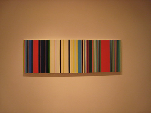
In the case of Andrew Graham, he uses color theory as a science, and plays visual trickery on the human eye.
The work must be seen in person close up and for an extended period of time.
A recent graduate of UPenn, Graham's lines of sheer color stream as if the color bars on a television set.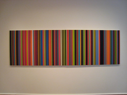
Utilizing artist's tape, each stripe almost blends perfectly into the other; its corresponding color at times completely unnoticeable, except upon second look.
Even when I took these pictures, I kept looking at my camera's image back to me.
Nothing was exact. The colors appear almost in motion, and no matter which setting I used, there continued to be at least a few colors that would transpose with another.
So not only do Graham's works play tricks with the human cornea, but also with digital 7.1 megapixel Canon shutters as well!
My favorite moment was suddenly noticing the tiniest band of lime green next to an earthy terra-cotta orange and pink.
It truly had escaped my eye, and I was so excited to be able to find it.
Here was my own Waldo, stripes and all, hidden in the crowded color field before me.
In Mel Davis' works, the canvas is prepared with such a gradual gradient hue, that it's again, almost unseen to the naked eye.
It is only upon deep introspection into the piece itself that the colors come out, and the different shades of blues take over.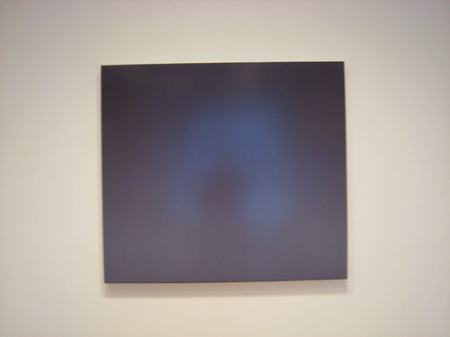 In fact, there's such a refractive quality to the light, that you can literally see yourself in the center of her images-- giving the works an almost mirror-like effect.
I was immediately reminded of the paint on vehicles from the 1950s-- the golden age of cars-- smooth paints, sparkling almost like the fins on a Ford Fairlane.
In the same way Davis' paint application has an almost retro feel.
There are certainly elements of the color-fieldists, but she is making the work her own.
In Tom Benson's work, the paint is the process.
At first I thought they must be poured directly onto the aluminum sheets beneath, their surfaces being as slick as an ice rink, but this is quite incorrect.
Benson's brushstrokes have a true craftsmanship quality with each subsequent motion of the hand. Only upon an extreme macro closeup photograph can you actually see the gradations from the individual brush hairs' grasping of the pigment.
Benson also develops his own paints.
On first look, this work appears to be a black rectangle-- nothing more, nothing less.
"A tribute, perhaps, to Malevich's black on black", I surmised.
But then I looked closer.
This wasn't black at all.
It is the deepest shade of green that there can be-- "Italian Green Earth" is what Benson calls this.
I imagined myself in the densest of dark forest-- old growth trees, sheltered from humanity, with no light from above, and only a soft mist caressing my cheek.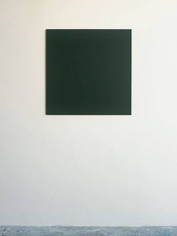 Perhaps a dark green moss lurks on the gallery floor; or overgrowing the rocks beneath.
Benson has set the mood in a way that really brought me into the works.
Mission accomplished.
This was more than just "color on a panel", but perfection in simplicity.
Here was a show tailor made for my weary, travel-logged soul, which almost accomplished a spiritual awakening.
Howard Smith has had numerous shows over the years and has an incredible knowledge of how to bring in the viewer into not only the image of the color-- each brushstroke at first glance appears to be an angry mark-making, but alas, it's not hastily made.
A long term explorer into paint as process, Smith's paint grabs each and every bead of cotton canvas, not unlike the skin of a freshly plucked chicken, seeing each bump appear where the feathers once called home.
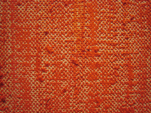
It is quite time-consuming, and he is careful of where each stroke chooses to lie.
Take a look at this closeup, and how the hyper-orange paint rests so perfectly upon each portion of the cotton duck.
It's pure beauty in saturation.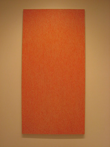 There is no need for gessoing or sanding with his works, because the canvas itself plays an essential role to each of his pieces.
There are similarities to Smith's painting style to that of Julian Lethbridge, who had a fantastic show last year at Paula Cooper Gallery.
But here, paint intersects with the blank sheet; like two lovers intertwined in embrace.
A beautiful thing.
The exhibit runs through Feburary 16th, so I highly recommend taking your own road trip down there, or if you're in the Philly area, it's a show not to be missed.
Oh, and if you have the chance, make sure to give a big hello not only to Larry and Heidi, but also gallery cat Pink, who is quite curious with art bloggers.
Apparently not only is she adorable, soft and furry and quite cuddly, but is a bit of an art world celebrity herself, having appeared in a photo spread in Art Forum, no less!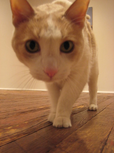 Truly precious.
For more information, go to:
www.artnet.com/lbecker.html

2 comments:
Thanks Oly, for your musings on the In Light exhibit at Larry Becker. I am hoping to get there myself to view the works.
During my last visit to Larry Becker, to see Merrill Wagner's recent solo show, I got to spend some quality time with Pink, as well as Larry. I appreciate Larry's passion for his artists' work and especially enjoyed his commentary on Wagner's paintings. Always on my list when I'm visiting, Larry Becker's gallery provides an intimate viewing experience.
Olympia...
Please come to Howard Smith show in NYC. If you e-mail mail@ressleart.com we can send all.
Best,
Denise Magidson for Bjorn Ressle
PS at Howard's request
Post a Comment