Wednesday, January 23, 2008

Philly Road Trip!

Several weeks ago, I had to get out of the city.

I felt I was chomping at the bit and just had to go somewhere... anywhere.

Stress was really getting to me, and sometimes the best thing one can do is go do something one loves, whether you have the budget for it or not, and that thing for me is travel.

My initial solution was "Go to Montreal," as I had done numerous times before, but that didn't work out the way I had planned-- an eight-hour bus drive and stomach ache from hell were huge factors.

And so I said, "Let's go to Philly instead. I love it there."

Having not set foot in the city of Brotherly Love since 1994, I figured I could use that extra dose of old brick buildings and cobblestone streets, so set apart by a successful historic preservation commission's hard work-- something New York City could use a good lesson in.

So off I went on December 30th and 31st, 2007 to close out my year-- a Sunday and Monday respectively, but not really the best time to go gallery hopping.

But it turned out I went there on just the right day.

My feet were aching terribly, having trekked all the way from the Italian Market and Bella Vista neighborhood all the way past Independence Hall, Franklin's Grave, to the Old City's amazingly transformed arts district.

Hungry, tired, and sick of seeing galleries with closed doors, there suddenly appeared a window of sheer color-saturated beauty I could not ignore.


This piece by artist Mel Davis' sat there in the window of Larry Becker Contemporary Art like my own siren's song of pulsating color rhythms pulling me in.

My nose pressed against the glass, the lights were on.

A woman came to the door.

Heidi welcomed me, the weary traveler, with a smile, into the gallery.
They weren't open, but were getting things together for the group show's launch to the public.

The exhibition, "In Light" delves into the possibilities of the color pallette; how canvas preparation and care can directly effect the viewer, playing with reality and our sense of space and time.

Mel Davis, Andrew Graham, Tom Benson and Howard Smith are a minimalist's dream quartet.

In this exhibit, there are direct references to the monochromes of Kasimir Malevich, Ad Reinhardt, Robert Ryman, and Yves Klein.

But along with the usual suspects of minimalism, monochrome painting and suprematism, each of these artists is doing something new with their respective works.

In the case of Andrew Graham, he uses color theory as a science, and plays visual trickery on the human eye.
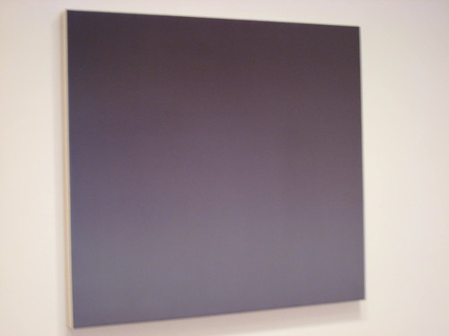


The work must be seen in person close up and for an extended period of time.

A recent graduate of UPenn, Graham's lines of sheer color stream as if the color bars on a television set.


Utilizing artist's tape, each stripe almost blends perfectly into the other; its corresponding color at times completely unnoticeable, except upon second look.

Even when I took these pictures, I kept looking at my camera's image back to me.

Nothing was exact. The colors appear almost in motion, and no matter which setting I used, there continued to be at least a few colors that would transpose with another.

So not only do Graham's works play tricks with the human cornea, but also with digital 7.1 megapixel Canon shutters as well!

My favorite moment was suddenly noticing the tiniest band of lime green next to an earthy terra-cotta orange and pink.

It truly had escaped my eye, and I was so excited to be able to find it.

Here was my own Waldo, stripes and all, hidden in the crowded color field before me.

In Mel Davis' works, the canvas is prepared with such a gradual gradient hue, that it's again, almost unseen to the naked eye.

It is only upon deep introspection into the piece itself that the colors come out, and the different shades of blues take over.
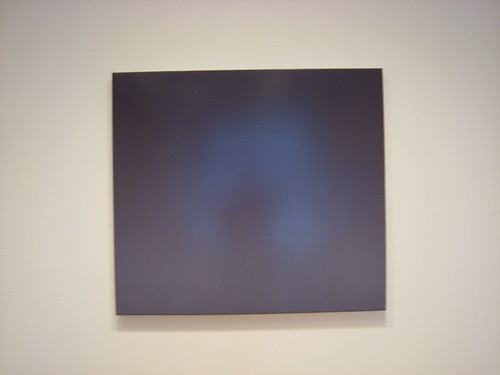
In fact, there's such a refractive quality to the light, that you can literally see yourself in the center of her images-- giving the works an almost mirror-like effect.

I was immediately reminded of the paint on vehicles from the 1950s-- the golden age of cars-- smooth paints, sparkling almost like the fins on a Ford Fairlane.

In the same way Davis' paint application has an almost retro feel.

There are certainly elements of the color-fieldists, but she is making the work her own.

In Tom Benson's work, the paint is the process.

At first I thought they must be poured directly onto the aluminum sheets beneath, their surfaces being as slick as an ice rink, but this is quite incorrect.

Benson's brushstrokes have a true craftsmanship quality with each subsequent motion of the hand.

Only upon an extreme macro closeup photograph can you actually see the gradations from the individual brush hairs' grasping of the pigment.

Benson also develops his own paints.

On first look, this work appears to be a black rectangle-- nothing more, nothing less.

"A tribute, perhaps, to Malevich's black on black", I surmised.

But then I looked closer.

This wasn't black at all.

It is the deepest shade of green that there can be-- "Italian Green Earth" is what Benson calls this.

I imagined myself in the densest of dark forest-- old growth trees, sheltered from humanity, with no light from above, and only a soft mist caressing my cheek.
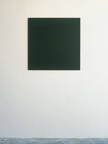
Perhaps a dark green moss lurks on the gallery floor; or overgrowing the rocks beneath.

Benson has set the mood in a way that really brought me into the works.
Mission accomplished.

This was more than just "color on a panel", but perfection in simplicity.

Here was a show tailor made for my weary, travel-logged soul, which almost accomplished a spiritual awakening.

Howard Smith has had numerous shows over the years and has an incredible knowledge of how to bring in the viewer into not only the image of the color-- each brushstroke at first glance appears to be an angry mark-making, but alas, it's not hastily made.
A long term explorer into paint as process, Smith's paint grabs each and every bead of cotton canvas, not unlike the skin of a freshly plucked chicken, seeing each bump appear where the feathers once called home.


It is quite time-consuming, and he is careful of where each stroke chooses to lie.

Take a look at this closeup, and how the hyper-orange paint rests so perfectly upon each portion of the cotton duck.

It's pure beauty in saturation.
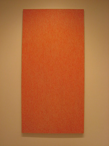
There is no need for gessoing or sanding with his works, because the canvas itself plays an essential role to each of his pieces.

There are similarities to Smith's painting style to that of Julian Lethbridge, who had a fantastic show last year at Paula Cooper Gallery.

But here, paint intersects with the blank sheet; like two lovers intertwined in embrace.

A beautiful thing.

The exhibit runs through Feburary 16th, so I highly recommend taking your own road trip down there, or if you're in the Philly area, it's a show not to be missed.

Oh, and if you have the chance, make sure to give a big hello not only to Larry and Heidi, but also gallery cat Pink, who is quite curious with art bloggers.

Apparently not only is she adorable, soft and furry and quite cuddly, but is a bit of an art world celebrity herself, having appeared in a photo spread in Art Forum, no less!

Truly precious.

For more information, go to:

www.artnet.com/lbecker.html

Monday, January 21, 2008

Yes, Canadians can be sexy, too


Untitled (3 Satyrs/ 3 Nymphs) 2007, by Theresa Sapergia.
Part of the "Captive Visions: Contemporary Canadian Art" currently on display at Eli Klein Fine Art.
Gloriously sensuous and a quite naughty piece.
Love it.

Sunday, January 20, 2008

Two curatorial things of mine you can check out


First off, I'm not one much to toot my own horn when it comes to my activities and private career outside of blogging (I feel it's a bit improper to give away too much) but in this case, I felt it's time to give my readers a link to something special I've taken part in.

I was one of three curators for the current Winter Salon showcase at Denise Bibro Fine Art here in Chelsea.

My invitational selections for the show of artists were works by Daniel Giese, Christopher Reiger, Martha Walker, Ric Dragon, Michael Paul Miller, and Sarah K. Bean (image on left)-- all of which I can say are truly stunningly fantastic works being done by these extremely talented artists.

I also got the opportunity to select the works of several of the gallery represented artists-- Lisa Dinhofer, Carol Jacobsen, and Charles Olson-- as well as assisted in the selection of the works of Josephine Haden and the ever fantastic Joyce Korotkin.

Originally the show didn't have a theme, but I found that with each of my choices that I was starting to tell a story with the works-- man's altering of nature; an apocalyptic armageddon on the horizon; sensual lines and loops; and mastery of color, line and form.

Everyone included in the show I'm so very proud of, so I would love it if my readers could check it out.

http://www.denisebibrofineart.com/exhibition/view/1153

My other recent project is not on the professional curator circuit, but on Flickr itself.

One of my favorite things about Flickr is the ability to have a "favorites" section.

(mmmm.... I'll have a Super Roast Beef with Horsey sauce, please...)


In my case, what I've gone about doing is try to remember everything and everywhere I've ever been before-- tracking sites and places from my childhood all the way up through today-- then going and finding them by doing Flickr searches.

Sure, that's time-consuming, and could possibly take up another lifetime, but it's worth it.

Included in my "selections" are searches for the Arby's Roast Beef sign in Tacoma, Washington; the Shell Factory sign in Ft. Meyers, Florida; Bok Tower and the Citrus Tower of Central Florida infamy; a pony in Wisconsin; Queechee Gorge, Vermont; Montreal; miniature daschunds, and places I want to see-- the Stave churches of Norway, for instance.

Image at right, "Norwegian Smile" by shoko!! on Flickr.

When I saw the Arby's sign still going strong, it brought a tear to my eye, as well as the tiny A&W Root Beer mug, which is exactly like the one I drank from when I was about three years old.

If you have 10-15 minutes out of your day, I highly encourage you to check out my slide show of these "curatorial selections."

They've just bowled me over in their quality and sentimental aspects.

As a question to everyone else-- if you have a Flickr account, please feel free to share them here.
I still think it's one of the best invention ever to view amateur and emerging photographers.

Enjoy.

http://www.flickr.com/photos/lamgelinaoly/favorites/show/

Monday, January 14, 2008

Mandatory art video site to check out

www.vbs.tv

Just some great interviews with artists there.

Check it out-- especially the Aurel Schmidt interview.

Friday, January 11, 2008

Gee, thanks, Bank of America and John Connelly

The United States of America was thisclose to having an industry go under and be forced to take responsibility for their own greed and ethically abhorrent practices.

But noooooo... Bank of America (my bank, thank you very much) decided to save Countrywide's ass from total annihilation.

Way to go, BOA!

Nothing says "lesson learned" by letting the upper echelons get away scot-free, as per usual, and have millions more in profits come their way from the continued shady practices of their brokers.

FYI-- the new way for brokers to get around the approval process is to stick people into "FHA" programs who do not qualify, and are not meant for this government-sponsored program.

Be prepared for the fallout from that one in another three years' time.

In related news, last night's opening for the A.A. Bronson's Shamanism exhibition at John Connelly Presents was wall-to-wall immobile last night and stank like piss, sweat, barf, dead fish, beer and cum.

No lie.

I literally almost threw up in there, it stank so bad.

Just like Bank of America, let's compare Connelly.

(image at right from Hrag Vartanian www.hragvartanian.com)

In one of the "pieces," performance artist Michael Dudeck sat there nude, covered in head-to-toe white body paint, cradling a dead fish, perhaps wearing a long black wig, looking about as intriguingly in depth and spiritually relevant as Keanu Reeves did in "Little Buddha."

Great show, you guys.

Much in the same way that Bank of America bails out a bankrupt system of corrupt businessmen, Connelly bankrolls artists that are continuously suited for theater and theatrics rather than work that is anything but hard-hitting.

And Terrence Koh's "glory hole" bathroom stall was about as brilliant an idea as any addict in the Port Authority john could come up with.

Great stuff.

Did they watch the news or something about Senator Larry Craig and his wide stance?

Because if so, the Brad Pitt and George Clooney video spoof was 500 times better.

First exhibit of the year I've panned.

Please excuse my hate-filled vitriol, but I just can't keep my opinionated self confined when I see this type of work exhibited when so much better stuff is available.

Perhaps this means I'll be blacklisted, and I'm violating the rules of "be nice and find the good things when you write reviews,"' but what can I say, I am what I am, just as they is what they is.

So to Mr. Connelly and corporate America, (you are one and the same, no matter what your flowery press release language is) keep on the keeping on by propping up complete and total junk.

Eventually you'll learn that the stench doesn't necessarily go away when the exhibit comes down.

It lingers.

Oly, over and out.

Sunday, January 6, 2008

Robert Appleton at Paul Sharpe Contemporary Art opening this Thursday

'Howdy, sailors.

As I've stated numerous times, sometimes work that really gets to me the most is made by artists that are having fun with their talents and not taking themselves too seriously.

And there's few artists I enjoy more than New York-based visual and performance artist Robert Appleton.

His visual creations and theater sessions always gives me a good chuckle, whether he's performing in fishnets dancing a chorus line county fair talent show audition; portraying Jeffrey Dahmer devouring watermelon human flesh on stage; painting mustachioed sailors who'd make any Village People member proud; or simply creating whimsically deviant sailor puppets in multiples.

In the past decade, Appleton has well-honed himself as a storyteller-- highlighting characters who might have downed a little too much of the 90-proof, if you catch my drift.

These are well-lived souls, with plenty of battle scars to show for it.

Appleton always gives an interesting take on their plights-- soon to set sail, a battle ahead, a life quite likely soon to be taken and sunk to the bottom of the sea.


Of course, many times his subjects have been society matrons, who truth be told can drink any sailor till he's weak in the knees, dropping them to the poop deck in crisp piles of Blue Jean Collars with bell-bottomed trousers.

You certainly do not need to be 'In the Navy' to knock 'em back.

If they give posthumous honors, Judy Garland could be a Navy Rear Admiral, for Christ's sakes.

It's a delight to see Appleton premiering his new sailor series at Paul Sharpe Contemporary Art in Chelsea based on portraits of actual sailors from 1750 to 1849.

Each one has lovingly been given his own personality.

In many cases, each subject seems to not necessarily look like he's very comfortable with his choice in careers.

Take a look at this poor fellow below.


After all, who would want to go to sea for months straight in those times?

You can literally read the dread on the sailor's faces.

Below is another fresh-faced foppish youngish chap.

His decorative hat is a nice embellishment-- but just what is that on his forehead, hmm?

Perhaps an in-joke, or perhaps not.

I do have to say I love the slight-of-hand subtlety in Appleton's pieces.

His questioning of sexual identity (bottled-up searing young masculinity cooped up in tight quarters for extended lengths of time) is a hoot, and quite truthfully spot-on.

Whew, it's getting a bit hot in here, isn't it?

Appleton possesses an almost cartoonish-style in his brushstrokes, giving his subjects these huge eyes, smeared lipstick, with hauntingly lit backgrounds.

It's almost as if Karen Kilimnik has met Toulouse Lautrec and they're tossing a few back while at port with Carol Channing and Napoleon.

This is one opening I will not miss.

Too bad it's not also Fleet Week, because that would be the icing on the cake.

Paul Sharpe Contemporary is located at 547 West 27th street on the 5th floor.

The opening is this Thursday, January 10th, from 6-9pm.

For more information, go to:

http://www.paulsharpegallery.com/

Tuesday, January 1, 2008

Let's start the new year off with a bang

Happy New Year, everybody!

Hope you all have sobered up and are ready for another year with The Musings.

Just got back from a fantastic, but quick, trip to Philadelphia.

More on that later-- I have a great exhibit coming up for your perusal from Larry Becker Contemporary Art.

But first, a quick spotlight on an artist I met at SVA's recent MFA Open Studios.

Her name is unforgettable-- Sarah Ferguson-- and her work as well.

Though she has immediate identification with British royalty, she instead spotlights our own royalty of American politics, the Queen herself, Hillary Clinton.

Imagining and juxtaposing herself into "photo-ops" with Hillary-- whether that of advisor, trusted confidante, or loyal friend-- Ferguson's work is not to be missed.

I love the humor in this-- the imaginative quality.

All of us at one time or another wishes we could have the ear of those in power, just to give them our own two cents' worth.

What also strikes me about Ferguson's work is her great ability to document the humanity behind the public image.

In the case of Hillary, far too often what we see so often is a manufactured being; stripped of her own femininity, and pandering to the lowest common denominator-- the "American voter."

But what Ferguson gets at is raw vulnerability through her paintings.

You can see the pain of a life lived-- and lived in its fullest, with emotional pain and baggage hidden and underscored by a brilliant mind, wrapped in powerhouse packaging.

In the nude at left, Ferguson imagined Hillary's makeup from pieces of different women's bodies.

After all, what Hillary represents at this time in history is is an amalgamation of the "American Woman."

Interestingly enough, if Hillary Clinton wasn't "Hillary Clinton," wouldn't the momentus occasion of a woman running for President be received quite differently?

Ferguson will soon have her Master's from one of our nation's top MFA programs.

I dare any gallery not to consider her work for its timeliness, its stunningly creative humor, and emotionally dark underpinnings.

Great one to watch in the year ahead.

Check out her blog at http://hillaryrealandimagined.blogspot.com/ and her Flickr page to see more great examples of her "photo ops" collection.

http://flickr.com/photos/shferguson/

Wishing all my readers the best in the coming year,

Oly

Tuesday, December 11, 2007

I usually stay away from the big guys, but in this instance....

Okay, truth be told, I don't think I've ever NOT liked a work by painter Ross Bleckner.

Scout's honor!

There's just something so perfectly linear, eternally graceful, organically significant, masterfully executed and luxuriously layered to all of his work.

I honestly dare you to find something truly negative to say about these pieces.

They're BEAUTIFUL.
BEAUTIFUL.
BEAUTIFUL!!!

When art takes on a sense of calm, of peaceful tranquility juxtaposed amongst all the hustle and bustle of "society" at large and avoids the "urgency" and pitfalls of the commonplace, and just "is," this is the definition of your standard, "run of the mill" pieces of Ross Bleckner.

His eye is brilliant in terms of color theory, of exploration into the subconscious, and the designs and formations that a "drifting off" accomplishes.

Close your eyes.

Relax your body, your mind, your soul.

What do you see?

I bet you see a bubbling out of reds, and lighter oranges from a dark-hued center, most often navy blue, or dark in nature.

I bet you might happen to see images of the still lifes of the 1800s come alive in a 21st Century motif, modernized, but not forgotten.

Each petal, each leaf of the botanicals takes on a new meaning.

The fresh dewdrops falling upon the petals is just the same as it were hundreds of years ago.

In much the same way Bleckner has taken these Rorschack-type creations and made them his own.

These pieces would be so at home in an evironment unakin to the everyday or commonplace art collector-- perhaps as a backdrop to a botany course in a freshman student's college courseload or a five-star lodge in the outskirts of the northernmost reaches of Saskatchewan.

I can't help but keep staring at these pieces.

In fact, when I saw them in person, I just stood there-- absorbing; their monumentality serving as almost an altar-like deity for me, taking it all in.

I wished my body could literally open a door to the visions of light; to the creations of new organisms, and absorb them into myself.

The floral arrangements take on an almost human-like quality to each of the pieces.

I did my best to imagine them in my own home, but alas, my checkbook is far too small and ceilings much too low.

I hope these works go down in Bleckner's encyclopedia entry as what they are-- new developments heavily researched and accomplished in an already full career.

Mary Boone should take it upon herself to stop focusing so much on her uptown space, and not forget the people who made her "Mary f'ing Boone."

Ross Bleckner is one of them.

A true modern living legend worth his weight in the gold standard.

This exhibit is NOT to be missed.

It is up until December 22nd and honestly will transport you into a new dimension.

Stay awhile in front of each piece.

It's well worth the break.

In honor of Xmastime, I've made up a song to sing along to...

"You're a bad-ass,
Mary Boone

You're the top of
every list

You're as charming
as a Prada heel

You're a hot mess mama
with delicious deals

You're a triple decker
delectible dish

You're the pride of
every collectors' dream

Mary Boone
it's Christmas, Javier Bardem is calling,

You've paid your dues
and you're no grinch"

(okay, so I'm not a lyricist, but I can direct you to the main site to check out more details, and that's no stealing XMas joke!!)

http://www.maryboonegallery.com/


Sunday, December 2, 2007

The Nakeds and the Nudes-- the art of Francien Krieg

Take a good long look at the image on the right by Dutch artist Francien Krieg.

Many of you will be instantly reminded of the famed Leigh Bowery portrait by Lucien Freud.

But while the Freud piece captured Bowery's persona non grata, the woman at right has much more to lose in her fully exposed form.

Nudity is at its base form the very definition of exposed vulnerability.

The model's largesse is literally starting to hide what defines her feminity; the genitalia fully hidden by the abdomen's rolls of skin.

But while previous generations may have viewed her as a "fertility goddess," or been termed "voluptuous," modern society frowns upon her, and hides her from view.

We are in a new era of shunning.

In fact, few artists today cover the human form in this manner, unless it's in the endless "snapshot aesthetic" of contemporary photography.

(Thank you, Nan Goldin for sending us down that dark and dreary path.)


But truthfully, I myself have never been one much for the full monty.

In fact, my first memories of being confronted with nudity were usually of my family-- and I didn't think twice about what it all really meant, nor did I care to.

Then, at about age 8, my mother took me into a B. Dalton bookstore.

For some reason I think my little mind hadn't yet grasped that not only was my family naked under their clothes, but also-- (drumroll)... OTHER PEOPLE as well.

And boy, did I get the crash course.

While mother thumbed her way through some Patti Boyd biography, my tiny hands picked up a copy of a John Lennon tome right next to it.

Then, opening the paperback to the center, I got my first real taste of NUDITY.

Not just nude, but NEKKID.

Not just NEKKID, but ARTISTIC NAKED-- i.e., John and Yoko, in all their flaccid, hairy, pasty glory, together, with little air separating their bodies.

My little mind felt immediately unclean.

But now I find myself, years later, typing reviews on a regular basis of artists that focus on highly-charged sexual content, or the dreaded "nude" word.

And truth be told, rarely do I bat an eyelash at the imagery.

I've seen just about every orifice in close-up form in some way or another.

From the Polaroid cock-sucking self-portraits of Terry Richardson, to David LaChapelle's plasticized shrines to well-endowed shemale Amanda Lepore, nothing seems to phase me; "Bores me," yes.

But for some reason, I've continued to have a disrespect for artists who ONLY choose to cover the human form.

But now that I've been doing some intense research of artists' web pages, I'm beginning to truly appreciate a finely-crafted and different type of nude.

Krieg's work is quite different than anything I've seen.

Her stunning use of foreshortening and manipulation of perspective truly makes these individuals come alive--flaws and all.

Maybe it's that hand shake I got when I happened upon Terry Richardson himself a few weeks ago that's made me rethink my opinion of blatant in-your-face sexuality.

He's didn't seem that bad of a guy, in fact.

But with Krieg, these are not necessarily sexual in nature.

Hailing from The Hague, Krieg's subjects are not your standard Vogue cover models.

Many are extremely obese, or at least can call cellulite as a dear friend.

They are real in every way-- you can see the veins lying close to the skin.

The bodies appear to be well-worn and lived in.

Stretch marks appear throughout the bodies.

You can tell that there's stories behind each face through the direct confrontation of the viewer, but while nudity again represents vulnerability-- you cannot pierce through their emotional shields.

In the image directly below, I especially love how the skin of the elbow is so rough and red.

Here is a woman who has experienced some hard times, and her eyes seem to challenge as if to say, "Yeah? So what? What are you going to do about it?"


Krieg is not represented by a gallery yet here in New York, but I bet it won't be long before someone takes notice of her seriously amazing work.


All art doesn't have to be beautiful, after all-- but there is a beauty in raw humanity.


For more information on Francien Krieg check out her web site at:


http://www.francienkrieg.com/

Tuesday, November 20, 2007

Richard Eagan's trip back in time

Recently I had the pleasure of gaining the acquaintance of Richard Eagan, a Brooklyn-based artist whose topical work really struck home.

One of the reasons I chose to move to New York City was because of its rich and layered history.

The neighborhoods were a marketing major's wet dream in "branding"-- Little Italy, Chinatown, the Lower East Side, Brighton Beach, and of course, Coney Island.

I remember as a freshman at B.U. how excited I'd get when I'd look across Commonwealth Avenue and see our very own short-lived franchise of weiner prestige, Nathan's Famous.


Now my own knowledge of Coney Island was not very well-versed, but I did have those legendary postcards of pop culture floating in my head-- rickety ferris wheels with cars swinging to and fro; bathing beauties and Vaudevillian sideshows; leopard-leotard burlesque girls with the Betty Page bangs; tatooed muscle men bench-pressing iron with their well-oiled bulging biceps heaving in the salty air.

Fast-forward to 2007. Things are quite different.

Mega-developer Thor Equities' stunning purchase of Astroland Amusement Park has given us an endless drawn-out saga "Was this past season the last hurrah, or will there be one more? Stay tuned."

With all the back and forth, it's as if we're being held hostage by these land-grabbers.

The only survivors-- the Parachute Jump (in some incarnation), and if spared the executioner, the Cyclone.

In the meantime, while the city, local community groups and business owners try to hammer out incorporation of the logistics of all this, Richard Eagan's work is a truly excellent way to reconnect to what once was.

I found it to be a true delight in its sentimental journey back in time.

Eagan has a rich and storied history himself.

A long-time Brooklyn resident himself, in the late 1970s he suddenly found himself having repetitive dreams of Coney Island and his childhood.

For years Eagan had crafted meticulous cabinetry and woodworks in his cabinet shop.

But suddenly things began to take on a new look.

A studio was emerging, as well as an artist.

Eagan delved into creating sculptural-like assemblage pieces which blended elements of the everyday along with the fantastic.

At the same time, along with artist Philomena Marano, in 1981 Eagan formed the Coney Island Hysterical Society-- a collaborative that worked to spotlight the ever-forgotten landscape of yesteryear.

Multiple artist projects were undertaken, including a mural, carousel and an actual haunted house/by-way-of-art-gallery carnival ride, the "Spookhouse. "


Looking at some of Eagan's earlier works, you can almost hear those echoes of "Step right up! Step right up!"

At left is "Fred's House," a piece done in 1982.

In the background is the haunting image of the dearly missed "Thunderbolt", a Coney Island staple for 75 years.

I really found this piece to be quite moving-- the soft-lit crescent moon in the distance.

After all, where else can you go to see the sky so well at night in the 5 boroughs, other than the Coney Island boardwalk?

It leaves me silent-- for I can find no words to express the sadness at never having been able to witness it in its heyday.

After the passing of his wife, Eagan took time away to regroup.

Once again, the boardwalk came calling.

But this time, Eagan also began to express himself with an alter-ego, Kay Sera-- a proper lady, if I ever did meet one, with style and elegance to boot.

She has had an immensely positive influence on Eagan.


Much in the way the chrysallis serves the butterfly, her creation has allowed Eagan to emerge from his cocoon, with wings outspread.

In fact, many of Eagan's pieces involve a starburst-like central creature, exploding from within.

The wooden shards, though they can appear quite dangerous, exist only underneath in a cage-like structure.

In some ways, it is guarded-- a protection mechanism, if you will.

But just who is Eagan protecting: the viewer, or the self?

I also am enthralled by the minute details of the work at right.

In this-- a wooden mock-up of the haunted-house ride previously mentioned-- you can see the tiny wooden planks of a boardwalk.

The saloon doors are perfect in their detail and weather-beaten quality.

The salt-laden air erodes the latex, leaving its mark.

Even the slight spaces between the boards are brilliant in their disalignment.

For Coney Island currently DOES lie in a state of disrepair.

The boardwalk's tens of thousands of wooden planks are deteriorating by the day.

But this fine city is more interested in the amount of funds that it will receive from the monolithic Thor rather than put new wooden planks in for people to enjoy the walk.


Below are images of "Kister's Hotel" and "Open All Year Round."

Again, there is a quiet to these works that I have a hard time describing.

In each, Eagan again reaches out-- windows into another world-- but it is to our detriment that they might not be there for much longer.

For more information on Richard Eagan, go to the link below.

http://www.440gallery.com/